

If you are new to having a brand or just need a refresh an revamping. There is always a place to start. That is a mood board and color palette. Each of these are for very different clients.

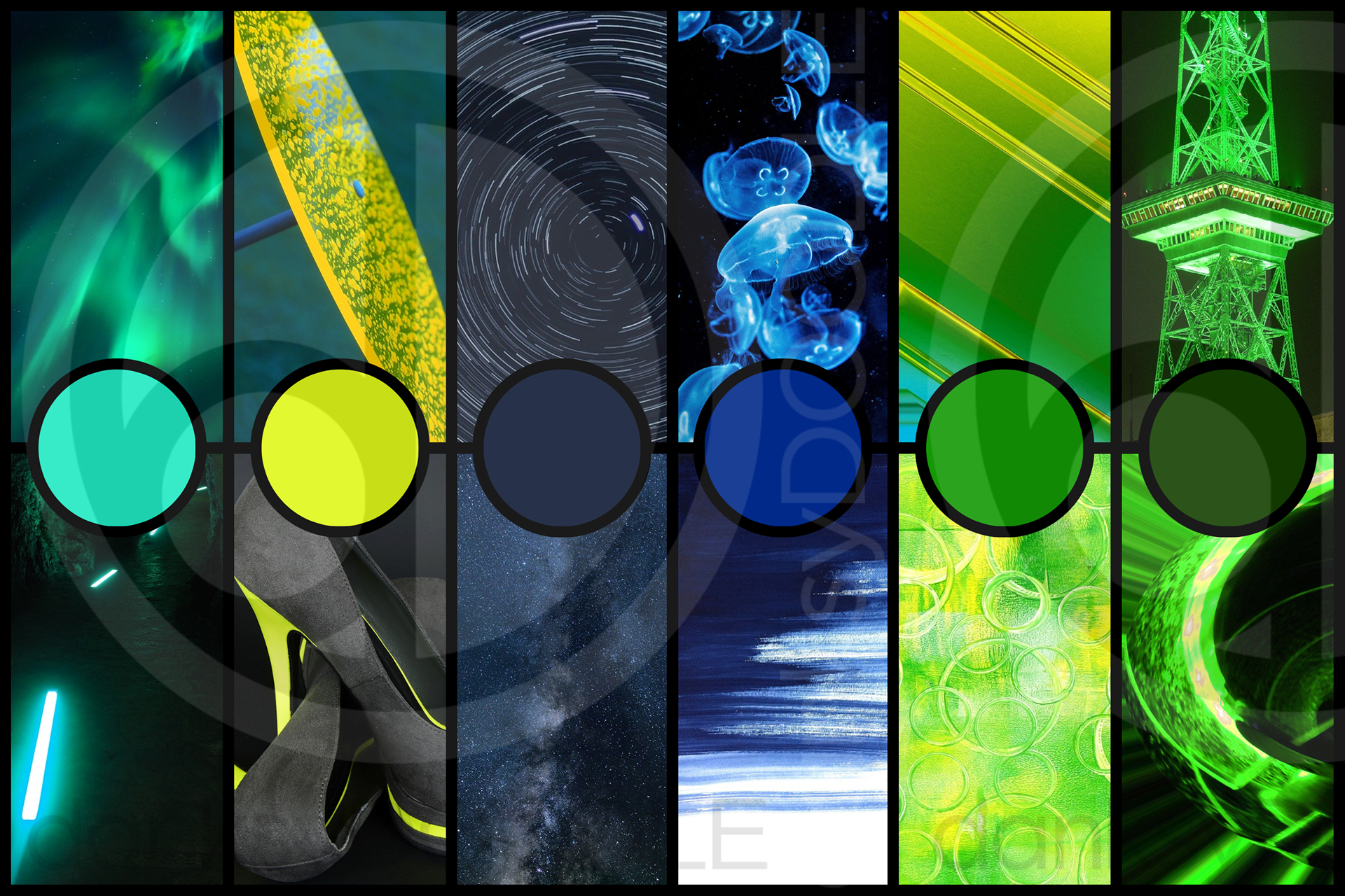
Above is the initial branding after a consult for a music streamer. They wanted something that wasn't the typical pink and blue synth wave design. I tweaked the palette to fit their brand. Those simple things are what can set you apart in an inundated space like music streaming.
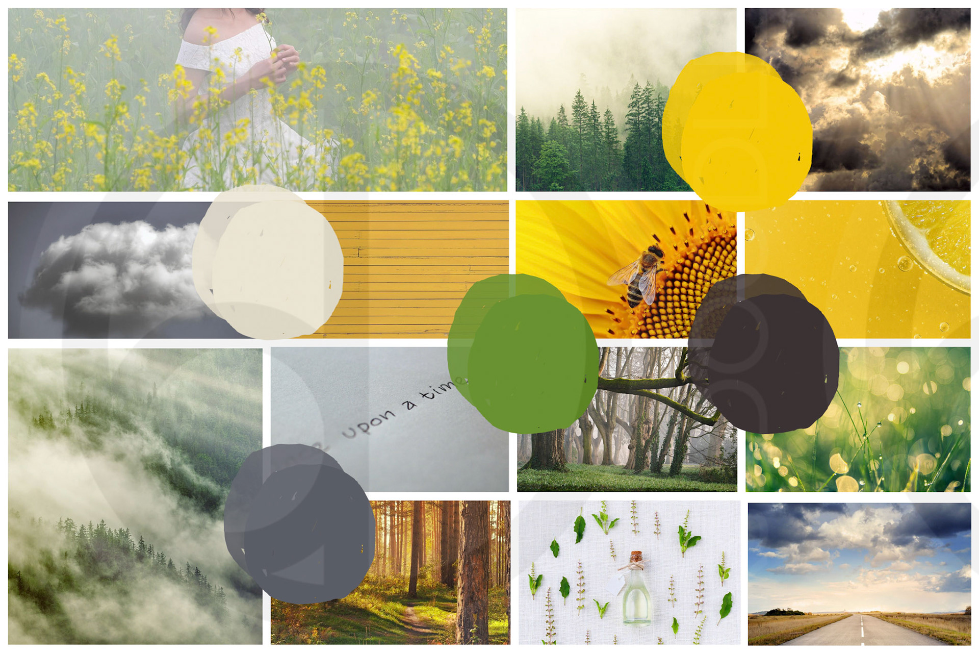
Above is the color palette for a fantasy writer's book series. This color palette has plenty of room to show the progression of their stories, while being cohesive with the themes. This was the jumping point for the book covers and the marketing.
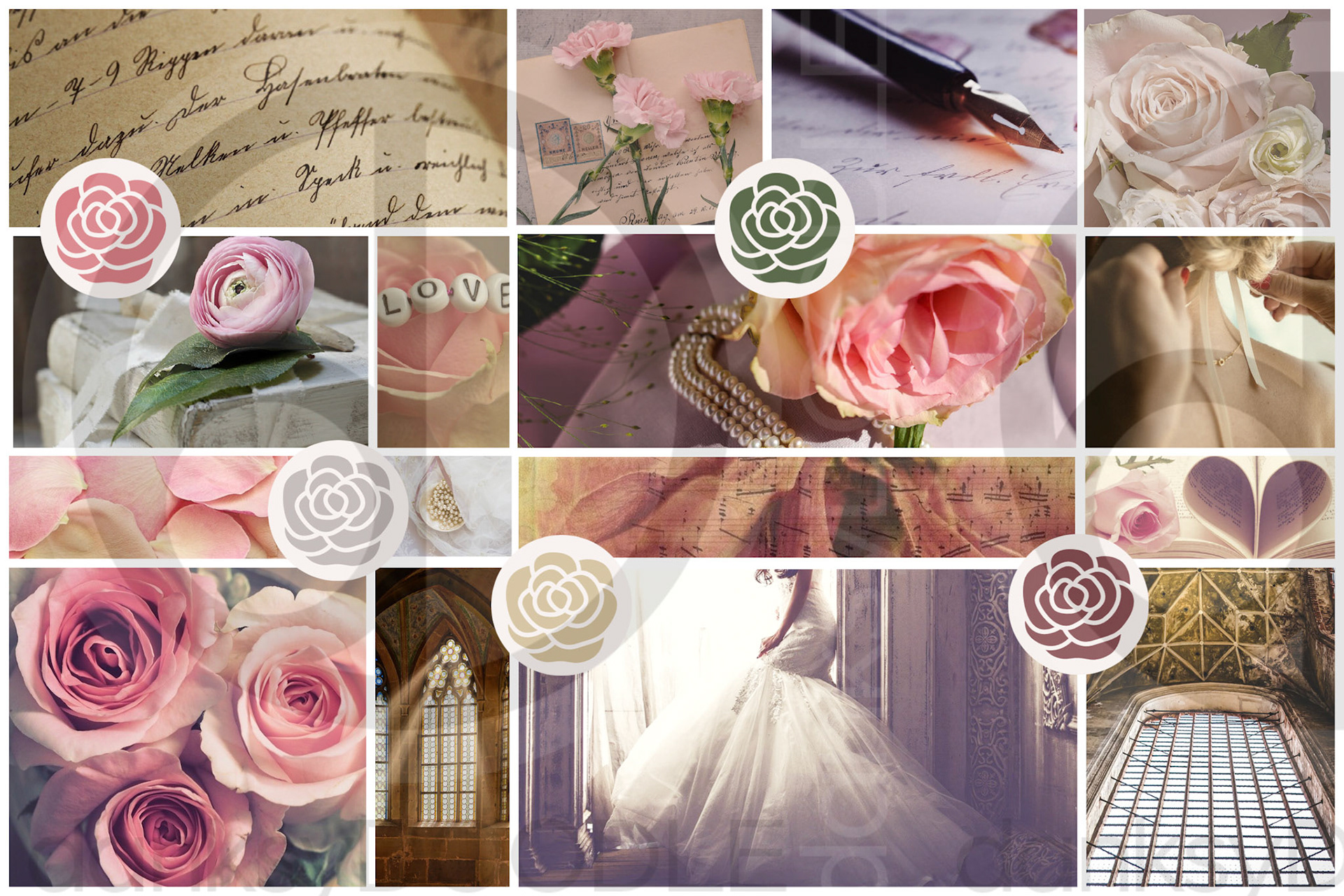
Above shows an event planner who was looking to redo their website with new graphics. These colors are soft and feminine and really showed off their design style. Wedding were their main focus so we really wanted her graphics to appeal to that versus the bright teal branding they had before. Overall they now have a more professional appearance in there industry.
Above is from the initial consult for a variety streamer. They stream few different things and they wanted something that really could fit with a lot of the things that they stream. We decided to a few different overlays that would accommodate their different streaming styles.